Landing page – is the page of the website where you want to direct users in digital marketing. Landing page of website requires constant optimization for maximum convenience to the user. The main message and landing page design must be as clear as possible for this.
Every day a lot of money spend on social media ads, Google (or other) search, video and display ads to attract traffic to the site. However, if the landing page does not meet the user’s expectations in the end, these ads will be just a waste of money.
In my opinion, the perfect landing page should be a flow that prepares the user from the top of the funnel to the bottom of the funnel. Creating such a page requires knowledge of human psychology.
The most interesting aspect of marketing is its association with behavioral psychology. When we talk about human behavior, we are not talking about in-depth medical education, but the ability of seezing that how they will react and behave in different situations.
But how to create a landing page that increases conversions using these psychological behaviors?
Banner (Key Visual)
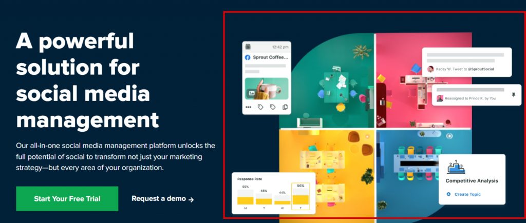
The first thing we do when preparing a landing page is to deliver our offer with a clear visual from the moment the user land the site. Because there is no more powerful tool than visual to deliver a message in the first second. The large banners you see on every website are also exist for this purpose.
Unique Selling Point & Value Proposition
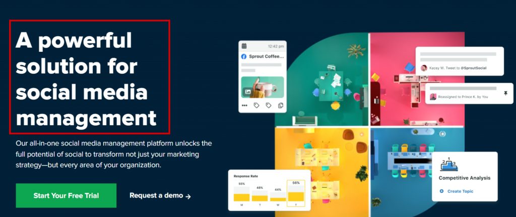
Value proposition – is an offer that states what your product or service is and what problem it solves.
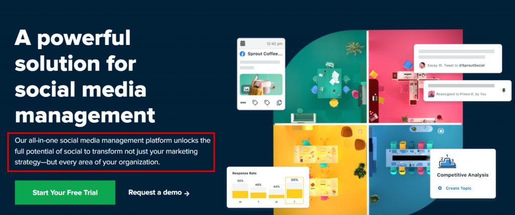
A unique selling point – is a feature that distinguishes your product or service from competitors and claims why customers should choose you.
Mentioning both of these factors on the landing page will create thoughts about you in the first seconds when the user has already landed on the site. USP will make the user want to explore the page more.
Call To Action (CTA)
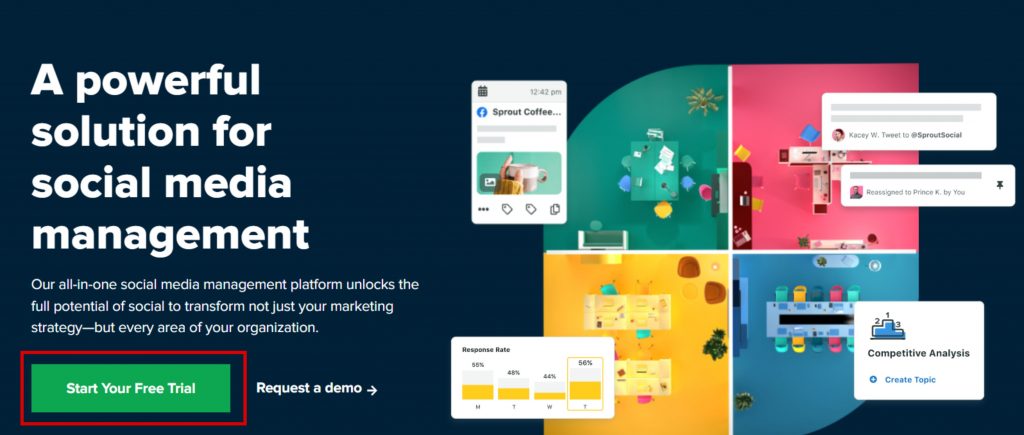
Placing CTA button on the banner or a near the banner will bring us a little closer to our goal in order to present your offer to the user.
However, a user who is not satisfied with the information received and wants to learn more, will continue to scroll through the page. What can we show them in the next step?
Clear & Relevant Copy
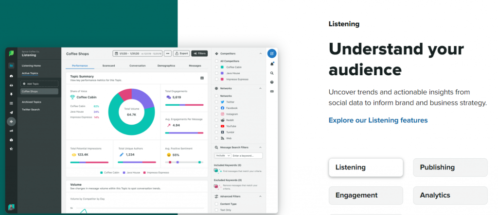
No need to put too much text on the page. The user must be able to read/scan it quickly and easily. You can use bullet points to show benefits. All distracting details on the page must be removed so that the user can take the action we want.
In addition to being clear, the text should be relevant to the user’s intent. If a person who lands on the landing page does not find what he/she is looking for, he/she will immediately leave the page. This, in turn, increases the Bounce Rate of the website.
*Bounce Rate – is a percentage of the user that leaving the site without engaging.
Benefit & Value
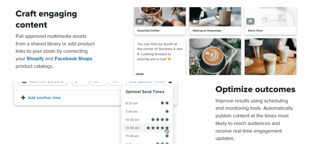
Explain the benefits of this product or service to the user with visuals and short texts, such as what it will change in user’s life and what problems it will solve.
Why Should I Choose You?
As I mentioned above, after highlighting the most important feature that differentiates a product or service from competitors, explain it and convince them why they should choose you.
One Action per Page
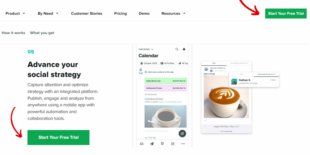
Redirecting a user to many links will cause confusion and distraction. As you know, the more choices mean the longer desicion-making process. For this reason, we should try to simplify the process and allow the potential customer to make a decision as soon as possible.
Trust Building
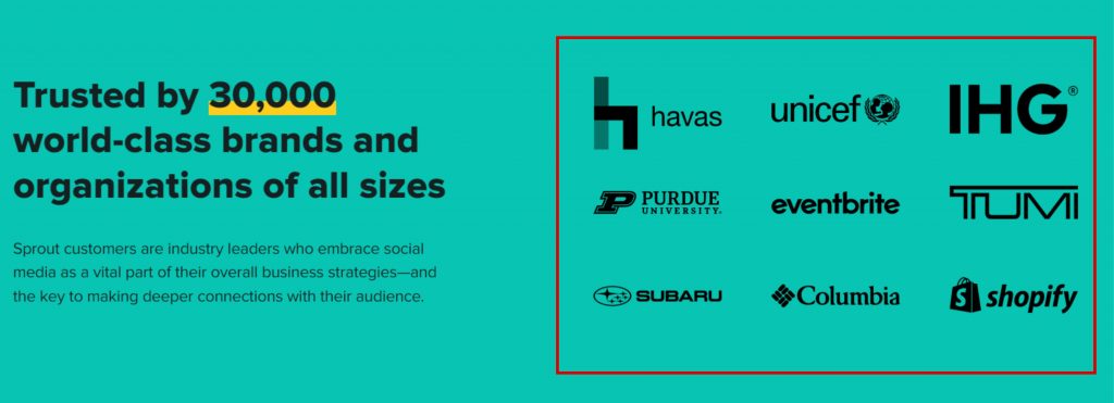
Even if the user is quite familiar with the unique selling point, value proposition and benefits, there will always be a doubt in it. Reducing these doubts and building trust in the product, service or company is the next step on the creating landing page.
At this stage, you can build the trust by presenting the logos of the companies you work with, the positive feedback from your customers, or your projects. Because the user will want to continue browsing the page only after trusting.
Final CTA
At the last stage of the page, you need to send the user to make desired action and turn it into a lead. To do this, try to bring them closer to the sale by placing the last CTA (Call To Action) button on bottom of the page.

Pingback: doxycycline monohydrate 100mg